[WARNING: dirty words herein] We are in the middle of our own logo competition so I thought it apt to demonstrate a few that went seriously wrong. Whatever was in the mind of the designers at the time is anyone’s guess. Top 10 worst logos - and I really mean worst.
10. Bottom Logo
In case you can’t tell - it is a Japanese house in front of the rising sun. what else could it be?
9. *Special* Surgery
Guess where I am not going for surgery?
8. High Fashion
Guess where I am going for clothes.
7. Fine Food

Sausage anyone?
6. Olympics
Even though people have pointed out the obvious problem here, they still insist on using this.
5. Pediatrics
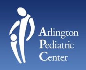
A picture paints a thousand words.
4. Children’s Clinic
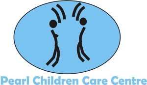
Don’t worry - be happy. Or not.
3. Pharmacy
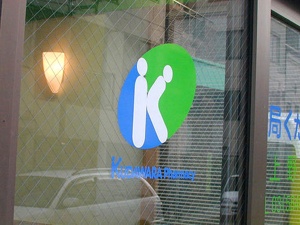
Enemas ‘r’ us.
2. Speechless
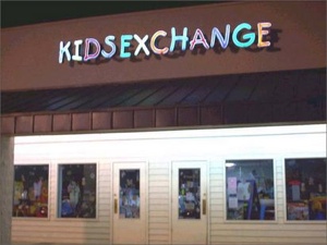
1. Open Wide
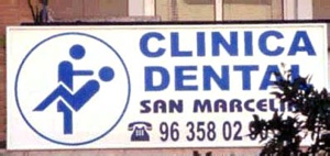
Bonus: We fix your computers
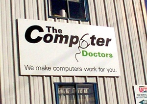
And your leaky penis.

0 comments:
Post a Comment